It’s been a great year for iconic album sleeves that helped shape the identity of our favorite releases. But which were the best? Here are our top 10 picks and the design inspirations behind them.
Cover art may have evolved from vinyl gatefolds and CD jewel cases to a thumbnail image on a digital player, but the essence of what makes a sleeve great hasn’t changed that much. An attention-grabbing cover can make you hear an album in 3D and spark a conversation, regardless of the process, tools or medium.
2016 has had no shortage of memorable sleeves, from the strikingly simple portrait of Solange adorning A Seat At The Table to the strange cartoon colors of the Lil Uzi Vs The World cover. We asked the designers behind our top 10 pieces of album artwork to explain the stories behind the sleeves. Check their answers out below, and scroll to the bottom for our full list of the album covers of the year.

10. Parquet Courts
Human Performance (Rough Trade)
Designer: Andrew Savage
Andrew Savage: “The cover is based around a painting that I was working on shortly after the album was recorded, and it wasn’t intended to have anything to do with Parquet Courts. As I worked on it, I was also working on getting elements together for the artwork. I knew I wanted the record to be blue, because that’s the color I saw when I heard the music via synesthesia – blue was what I associated with the sounds. As I continued work on the painting it eventually became apparent to me, because of the vulnerability, fear and helplessness that I had put into both the painting and that record, that they were meant to live together.
“Nearly everything I do for Parquet Courts is done by hand – whether it’s a painting or drawing, or handwriting all of the lyrics and liner notes, which I always do. So it all starts out as work on paper or canvas and then is photographed, then I format in Illustrator. It took about a month and a half to put everything together, which includes the jacket obviously, but also the inside, the booklet included, the labels.”

9. Nisennenmondai
#N/A (On-U Sound)
Designer: Shintaro Sakamoto
Shintaro Sakamoto: “The artwork took one week to make and we made it using a mixture of plastic mesh trays, spray paint cans and Photoshop! I wanted to express an image that sounded most like the album’s music, therefore regular repetition and accidental deviation were the central themes.”

8. Powell
Sport (Diagonal)
Designer: Guy Featherstone
Guy Featherstone: “In May, Powell came out to visit me in Portland so that we could work on ideas for Sport whilst generally getting smashed every night. During this time I sketched some cover ideas and had conceived a version of the sleeve artwork, although we needed to find a way to really push the idea of Sport as far as possible. This wasn’t the first outing for the Powell ‘man’ – he made his first appearance on the cover of Club Music, and since then I have tried to personify our typographic friend through many adventures and situations. Just when you think you’re out of thoughts and ideas for him, something magical happens. In this case, he got sporty!
“We settled on the original standing Powell man for the sleeve, but this time he was different. Inspired by the Olympics and a summer of competitive physical activity, we drew on the aesthetics associated with sport — from the stripes and graphic lines we’re all so familiar with to the configurations of colour. The superb visual language created by Otl Aicher for the 1972 Munich games was a great feeding ground for many of those early ideas — so thank you, Otl!”

7. Mukqs
Walkthrough (Hausu Mountain)
Designer: Max Allison
Max Allison: “For Walkthrough, the base template onto which I layered different textures was a screenshot from the Super Nintendo game Umihara Kawase. I love the elegance of this game’s checkered platforms, all laid out against simple backgrounds into a kind of floating world through which the player swings and climbs around. On top of the base layer, I mixed in imagery from other games like Mega Man X, Super Castlevania IV, F-Zero, and Indiana Jones (all for Super Nintendo). In sourcing materials from these games, I’m not aiming for any kind of nostalgia or throwback effect. I’m more interested in exploiting these old games for their raw visual qualities, which I find to be beautiful and interesting on their own, outside of any sort of historical perspective or personal obsession.
“I love blowing up pixelated images to high resolution, to really see the geometric textures – and to juxtapose that vibe with other smoother, grainier, or more realistic textures into a kind of hybridized multi-media image which still maintains a flatness similar to a hand-made collage. This process typically takes many hours, during which I focus on the details of each overlay and the way in which different textures and colors interact.”

6. Equiknoxx
Bird Sound Power (DDS)
Designer: Jon Kraus
Jon Kraus: “The music is really sample-based so it felt right working with texture – the background image is actually from a shot by good friend Eoin Macmanus and there are certain tracks, like ‘Clunk & Clink’, that sample all manner of fucked up library/concrete type sounds, so the chain graphic just seemed to make sense.
“The bird is Henry the Hawk, which was born out of the trademark bird sound that Gavborg uses in his production. Listen from 31:30 in this interview to hear more about that. The tagline on their SoundCloud is ‘Bird Sound Power’ because of this and that’s why we suggested that for the name of the record. Since that interview the bird has acquired a name and is now affectionately known as Henry the Hawk!”

5. Steve Hauschildt
Strands (Kranky)
Designer: Leigh Silverblatt
Leigh Silverblatt: “I had spent a good two weeks listening to the album prior to beginning the artwork. When I work with audio, I tend to assign certain colors and shapes to sounds that I hear – it is common for people to assign certain colors to certain emotions. At the time that we began the artwork, Steve hadn’t finalized the title of the album. As we were developing the concept he specified that he was interested in a composition consisting of a sequence of strands of rope, akin to DNA strands, with the negative space between them increasing gradually.
“The work was composed in a 3D modeling program called Cinema 4D. Steve had come across a plugin called Reeper X for creating rope forms – you can adjust certain parameters like the number of coils and the space between them. The objects in the image are actually solid white, so the lighting was what brought color to the image, which meant that the positioning of the lights was very significant. I also put a lot of emphasis on the shadows and the positioning of the camera to create a sense of depth. Altogether the artwork took us about two months. Steve is a bit of a perfectionist at times, but we have a good partnership because we both have very high standards for our work, and we are able to intuit things to each other. We often share a common vision, with very minimal verbal communication.”

4. Solange
A Seat At The Table (Saint Records)
Photographer: Carlota Guerrero
Carlota Guerrero: “Solange wanted a close-up portrait that said something like, ‘This is a conversation we are going to have, and you cannot avoid it.’ We worked very closely together. We came from spending two weeks together filming the music videos for ‘Cranes in the Sky’ and ‘Don’t Touch My Hair’. She had a clear idea of what she wanted, and we played with the soft dreamy kind of light I normally use. Camilo Fuentealba assisted me.
“I shot with my Pentax 6×7 and we used natural light. We shot the photos in a morning in a studio in Brooklyn. The graphic design of the album and the book was made in collaboration with my good friends from Querida studio. Neal Farinah, the hairdresser, put some clips in the hair to keep the waves. They were not supposed to be the final art, but we liked it them so much we decided to shoot it, and then it became Solange’s favorite shot.”

3. PUP
The Dream Is Over (Royal Mountain Records)
Designer: Chris McKenney
Chris McKenney: “I took the photo with two of my friends, Barry Barosky and Dillon Utter, in the woods on a whim one day. My photos consist of layering and masking multiple different photos in Photoshop, and I think this image fits perfectly with the album once you give the record a full listen! PUP reached out to me for this photo a few years after I made it, and it’s cool to see something I created so long ago relate to something created by such a cool band right now.”
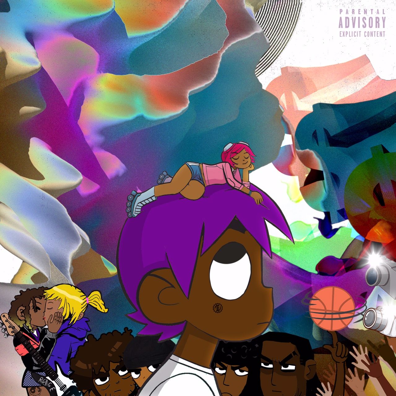
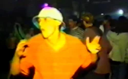
2. Lil Uzi Vert
Lil Uzi Vert vs the World (Self-released)
Designer: Farris
Farris: “Uzi told me he was basing the project off Scott Pilgrim Vs. The World and wanted to have the same vibe. I watched the movie and started to plan how the cover would look. I saw the image of Scott and Ramona online (where she’s on top of his head) and manipulated it to represent Uzi and Brittany. Uzi loved it and we started to plan the rest of the cover around that. The people at the bottom represent Brittany’s past relationships, Uzi’s fans, and paparazzi. The colorful background highlights Uzi’s other-worldly style. I wanted it to look like an unnatural world to emphasize his originality. People get confused as to what it is, but it’s supposed to be the sky of his world.
“While we were creating the cover we would bounce ideas off one another to figure out what would look best. It’s a great experience when you work with someone who shares your same vision. This whole process also made me realize how important the cover artwork is to an album, because Uzi cared about it so much. I hope that everyone can realize that at some point.”

1. Young Thug
JEFFERY (300 Entertainment)
Photographer: Garfield Larmond
Garfield Larmond: “The idea for the cover came about when we were in New York in the VFiles office. We were going over some pieces that were going to be shown during their runway show when we came across a designer by the name of Alessandro Trincone. When Young Thug saw the pieces, he said, ‘I want that for my cover.’
“Once Young Thug got to the shoot, a lot of time was actually spent just putting on the outfit. I would say over an hour went into getting the outfit on and making adjustments to the hat alone. I shot the cover on a Canon 6D. The way I see everything coming together, from the artwork to the music, is the simple idea that it is him. It is Young Thug. It is Jeffery. He personally took the time to express his own idea through the cover. I didn’t say, ‘Hey, we need to shoot this and it needs to look like that’ – he knew what he wanted and I was able to bring it to life.”


![Ryoji Ikeda installation data-cosm [n°1] extended at 180 Studios until 1 February, 2026](https://factmag-images.s3.amazonaws.com/wp-content/uploads/2025/12/data-cosm-ALubbock_180-14Oct-3554-250x155.webp)
![180 Studios presents new Ryoji Ikeda installation, data-cosm [n°1]](https://factmag-images.s3.amazonaws.com/wp-content/uploads/2025/10/ryoji-ikeda-data-cosm-1-250x155.webp)